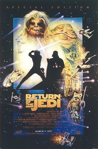


Star Wars Special Edition - Return of the Jedi
January 1997
These three posters should really be set up together. Then the
power and beauty is trippled. Note the completion of the
composition
when A New Hope is on the left, Empire is in the middle and Jedi is on
the right. See how the exploding design centers in the middle of
the poster for Empire. All the elements explode out from this
center.
Note the symmetrical reflection of composition and character elements
on
the left and right with A New Hope and Jedi. This gives a power
and
stability and presence which can only be appreciated when all three are
together. Amazingly, the compositions work wonderfully when each
of the posters are seen separately but then works beautifully and
differently
when all are seen together. Appreciate the color character given
to each separate film but how they also work when seen together. Red
for
A New Hope, blue for Empire and green for Jedi.
An amazing piece of work.
If you would like to see them all together as the artist intended them
to be seen, check it out on Drew's own web site at
www.drewstruzan.com.
You can find a link to his page on the Drew Struzan section of this
site.
